PlutoPay
A secure wallet for sending, receiving and shopping.
PlutoPay is a responsive web app for sending and receiving money and shopping, securely. I designed it solo, end to end, over 22 weeks part-time, following the Design Thinking process.
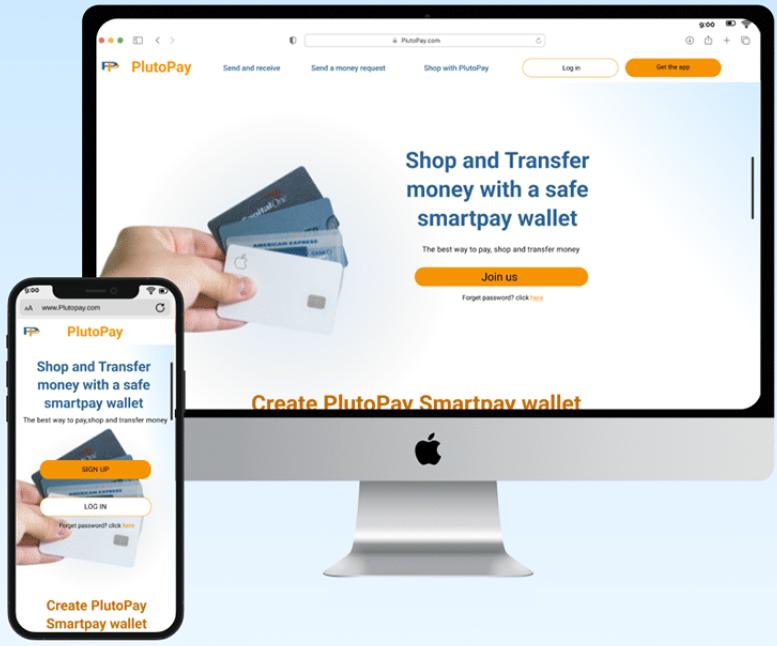
The challenge
More people need to pay, transfer money and shop from one trusted place, without a visit to the bank or a physical card. The question was whether they would trust a new app with their bank details.
Goal. Design an app that people create an account on and use daily for their financial needs.
My role
- Ran the whole project: research, UX, UI and testing
- Surveyed 27 people and interviewed 4
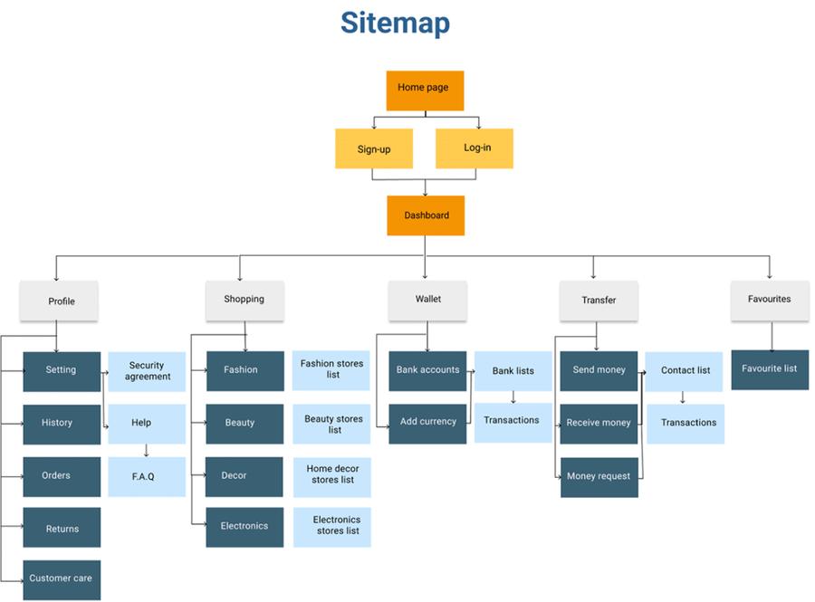
- Built personas, journey maps, flows and a sitemap
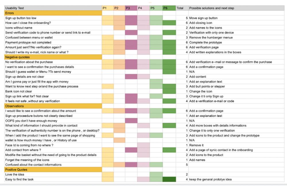
- Tested mid-fidelity wireframes with 6 participants and iterated
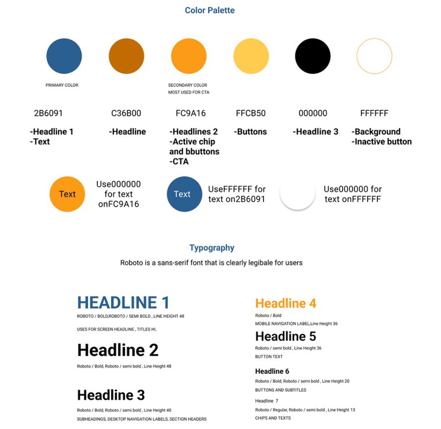
- Created the brand, design system and final screens
How we got there.
Understand
Problem statement, possible solutions and a SWOT of two competitors.
Observe
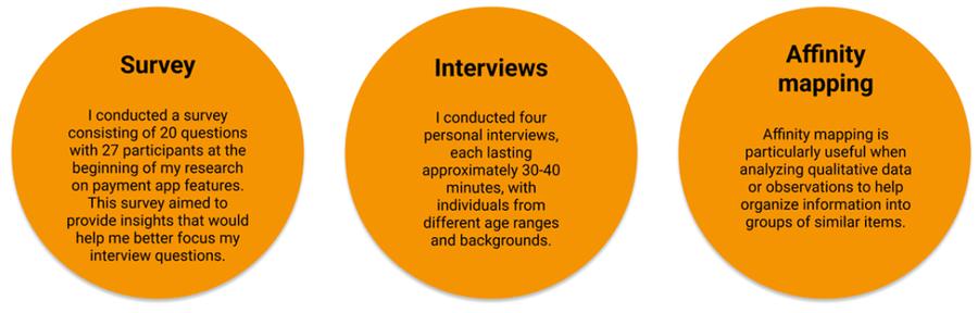
Survey of 27 people (20 questions), 4 interviews of 30–40 min, affinity mapping.
Define
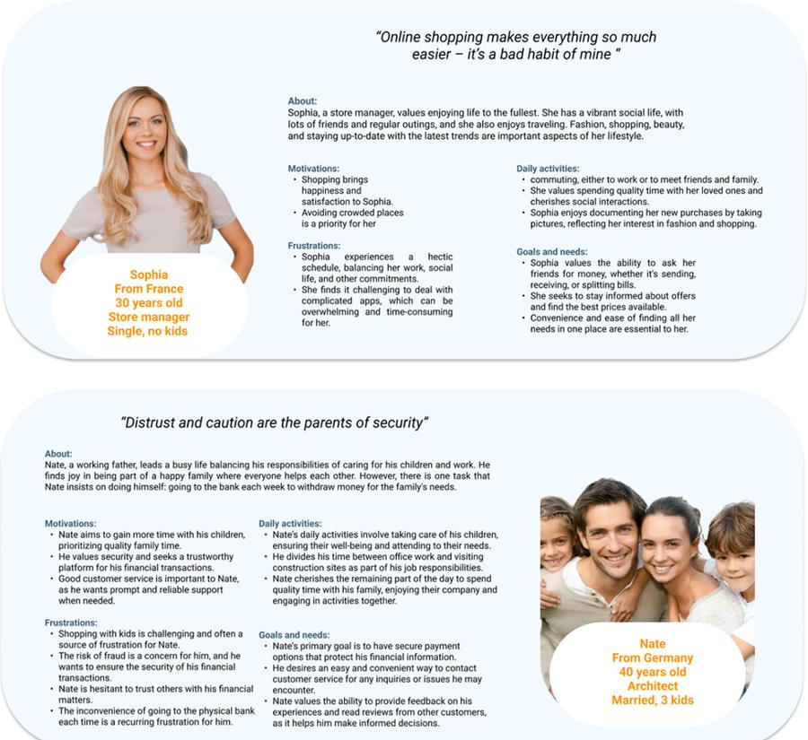
Two personas and journey maps: Sophia, a shopper, and Nate, a cautious parent.
Ideate
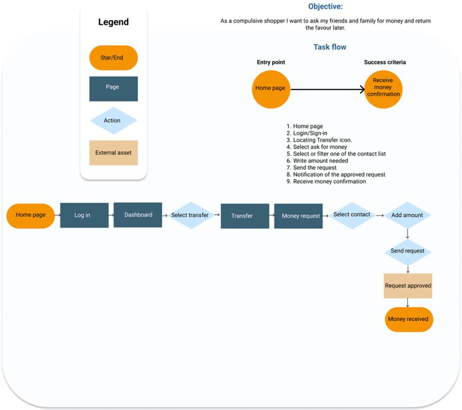
User flows, sitemap and paper sketches.
Prototype
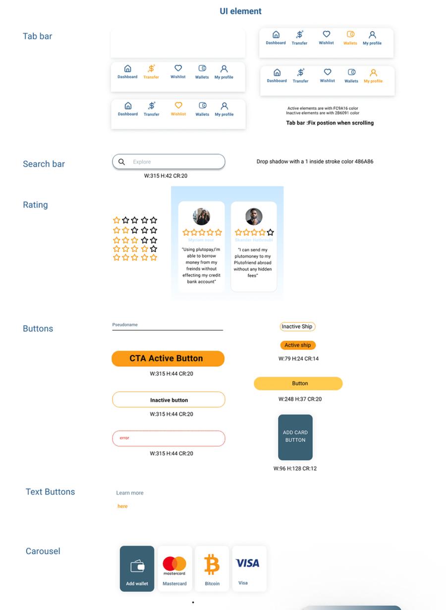
Mid-fidelity wireframes, then a design system.
Test & refine
Moderated tests with 6 participants on 5 tasks, fixed in the final design.
What it looked like.


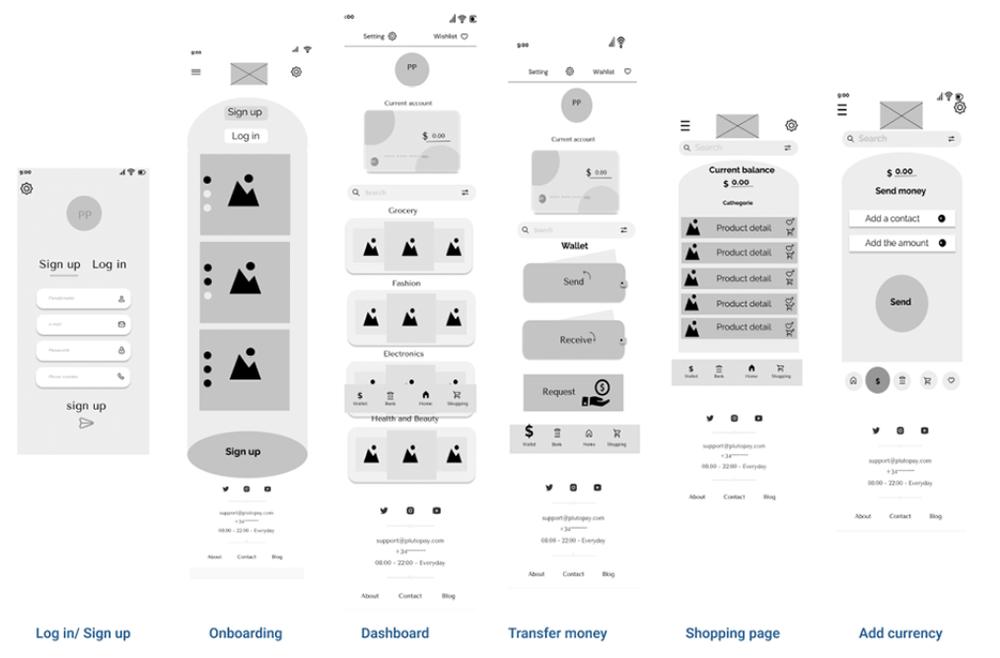
What changed.
Testing showed the biggest gaps: all six participants wanted confirmation and verification after payments, and could not find how to close the onboarding. Five of six missed the sign-up button.
The final design adds a confirmation and verification step, a close control on onboarding and a higher sign-up button, with blue for calm and trust and orange for action.
What I learned
Trust beats features. People were happy to pay by card but hesitated about credit, so security cues and confirmations mattered more than extra functions.